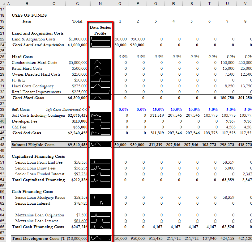
Sparklines are a recent valuable addition to Excel’s slew of offerings. A sparkline is just a data series graph that sits within a single cell in the spreadsheet. As shown boxed in red above, sparklines can be used to display the profiles of individual data series instead of creating large single- or multiple-series charts that visually overlap your model’s row and column contents.
Benefits of using sparklines
Every mini-graph tells a story individually, and in concert, they all tell a comprehensive story. For instance, in the screenshot above, I can tell with a 5-second glance down the sparkline column that:
- Land acquisition occurs prior to the start of construction
- Construction spending follows a bell-shaped curve
- Soft Costs are front-end-loaded.
The alternative to this would be to scan horizontally along each line item, scrolling all the way to the right to make sure that I’m not missing any data points in the out years.
In addition to being able to learn the story of the deal very quickly, another benefit of being able to visualize these data series graphically in relation to one another is that if there is some large mistake in the projection, it will jump right out at me.
For instance, if my Retail Tenant Improvements (line 32) sparkline spiked prior to the end of base building construction, I would be very suspicious about whether the timing input for the retail TIs was correct or not. In short, sparklines can protect you from yourself.
How to create sparklines in your spreadsheets
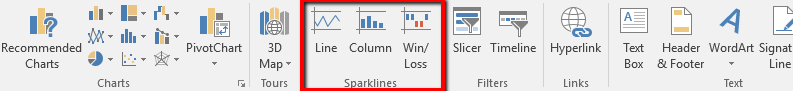
Step 1. Select the cell in which you wish the sparkline to appear
Step 2. Insert > Sparklines (to the right of the Charts menu)
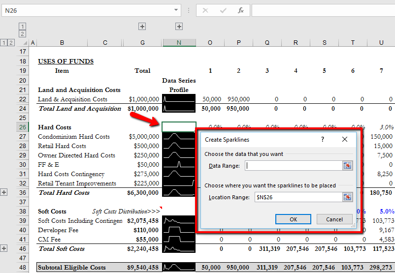
Step 3. After you select the type, a dialog box will appear, as shown below. The bottom input field will already contain the coordinates of the currently-selected cell, so assuming you still want the sparkline to appear there, there is nothing to change. The only thing that remains is to specify the Data Range (top input field) that you wish to display in the sparkline. You can do this by simply selecting the range with your mouse (the coordinate array will automatically populate in the Data Range input field). When you’re done, click the OK button, and your sparkline will be in the selected cell.
Selecting the appropriate type of sparkline
I have found that Line sparklines are better suited to displaying monthly data series, and Column sparklines are better suited to displaying annual data series.
Formatting your sparklines
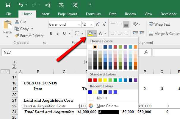
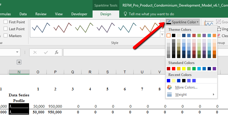
You probably noticed that the sparkline you have created does not look like the examples shown above. This is because as a default, Excel will make the sparklines have a background the same as the cell in which they’re placed. To reverse out the colors like I did, select the sparkline and fill the cell with whatever color you want via the Home tab of the ribbon:
Then you can edit the color of the existing sparkline itself by clicking on the Sparkline Tools menu item that appears at the top of the ribbon above the Design tab label, and selecting the color as shown below.
Important nuances to know
- You can save a lot of time creating sparklines for multiple rows of data by simply copying the first sparkline cell you create and pasting it down the sparkline column.
- If you do this, then by default, the data range being represented for each line item is the same, so the changes in the sparklines relative to one another can be viewed as all happening on the same exact timeline.
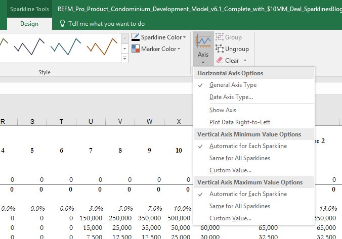
- There are other detailed settings available in the Axis menu that you can change to your liking
Enjoy and please post questions and comments below.